Issue #32: How brand packaging is evolving
Albertons launched a private-label brand this week, and it looks very similar to Target's...
I haven’t written a ton about packaging design here, but in a few weeks, I’ll be publishing an interview with a Gen Z founder of a viral snack brand, and I’m very excited about it! But before that interview goes live, I wanted to unpack some trends in CPG packaging lately.
I’ve been seeing a lot of chatter around the shift from specific, recognizable, legacy branding in the CPG space (think: Heinz and Kellogg’s) to colorful, bubbly, playful aesthetics (think: Graza and OmSom). The trends in packaging and brand design are occurring both in new products in the CPG space, as well as among legacy brands.
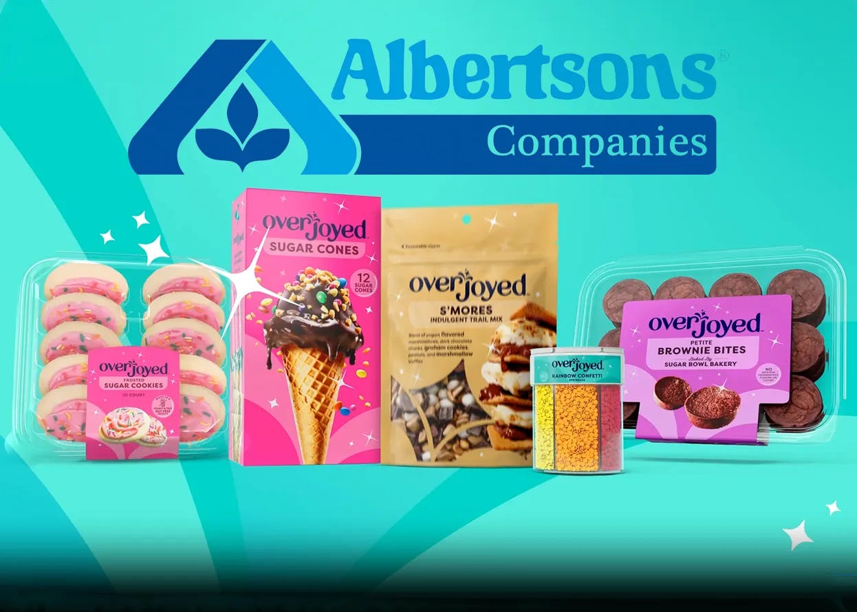
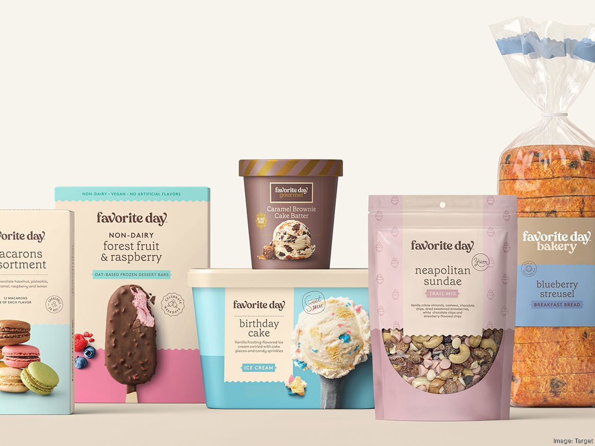
And earlier this week, grocery-store chain Albertsons launched a new private-label brand, Overjoyed, which is “dedicated to celebrating special occasions.” When I heard about this, I immediately thought of one of Target’s private-label brands, Favorite Day. Upon further look, it’s evident that Overjoyed’s name, products, and packaging have so many parallels to Favorite Day.
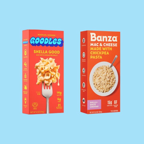
The trends in CPG packaging have resulted in a lot of items looking the same. As I walk down the aisle of my local Whole Foods, a box of Goodles mac & cheese looks rather similar to a box of Banza pasta…
So why is this happening?
Packaging is a way for brands to target Gen Z. And Gen Z is drawn to bright, colorful, bubbly packaging. We want pretty items lining our kitchen cabinets and refrigerator shelves. And often, we’re willing to pay a premium for it. It’s as simple as that!
Product packaging changes may signal a real or imagined shift in product quality, too. Take Goodles – the boxed mac & cheese above on the left – they sell a product that I reach for on a regular basis. I was initially drawn to the packaging, but I’m also loyal to the brand because of the posited nutritional benefits of Goodles, compared to a box of Kraft mac & cheese. Goodles does have more protein and fiber than Kraft’s competing item, but even if it were the same product, the visual appeal of the Goodles box might just convince me that it’s better-tasting or better-for-you than the old-school item that’s been on the shelf forever.
However cute, these packaging trends have resulted in a lack of visual diversity among CPG items. When everything starts to look the same, items lose their recognizable brand and cultural specificity, which may result in the loss of brand recognition and loyalty among customers.
Packaging rebrands can be opportunities for brands to expand their customer base. Expanding beyond just Gen Z as a target audience, we’re seeing a lot of brands attempt to reach broader audiences through packaging rebrands.
Take an item like protein powder, for instance. Protein powder has historically been marketed to men as a supplement to help build muscle mass. Recently, more and more women have started lifting and consuming protein powder as well (thanks in part to the normalization of these activities on social media, as well as the democratization of health information!).
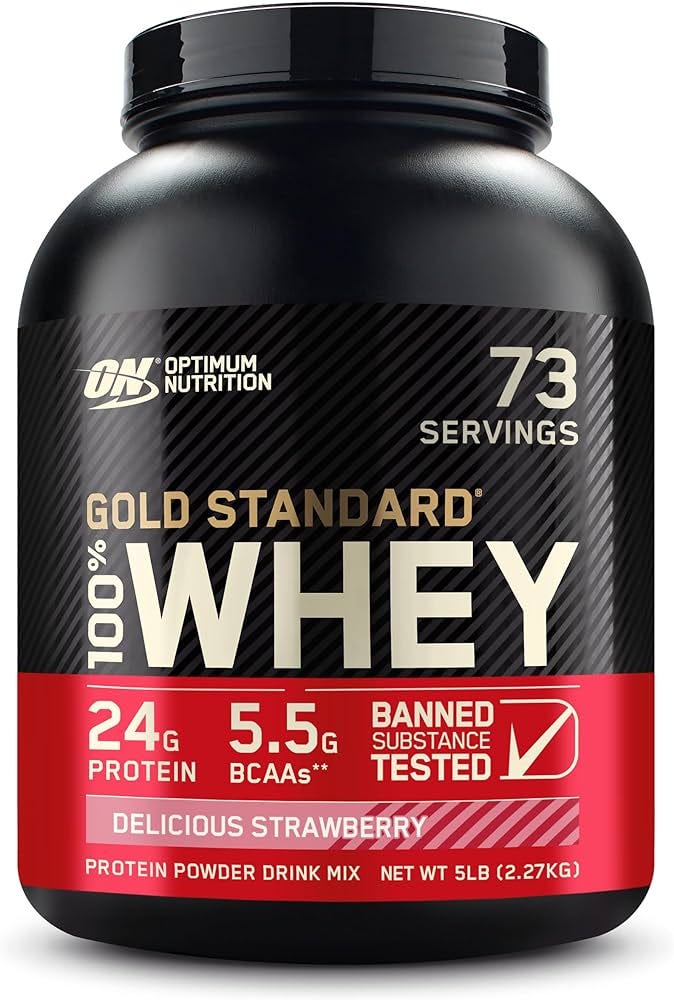
Despite this cultural and social shift, we were still seeing protein powders with intense text, dark colors, and technical copy. This is still what comes to mind for me when I think of protein powder:
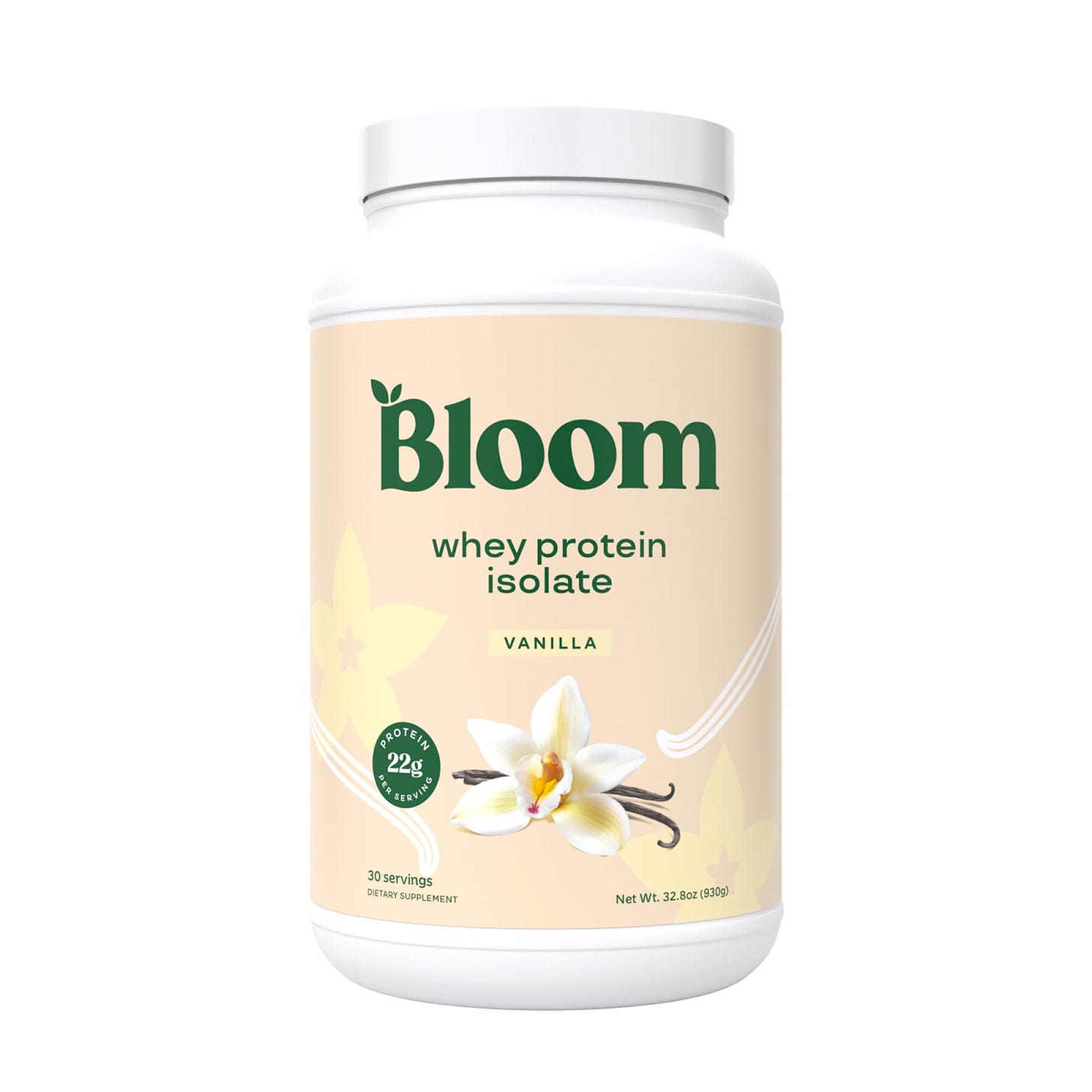
But recently, protein powder brands have begun to evolve, and new brands have begun to pop up, with more accessible packaging design. For example, Bloom’s protein powder below looks a bit more aesthetically pleasing, minimalist, and accessible. There’s no unnecessary copy, and it still tells me what I need to know.
New brands and packaging redesigns that subvert traditional protein powders are intended to expand the audience base and reach new customers who might have been deterred from protein powders in the past.
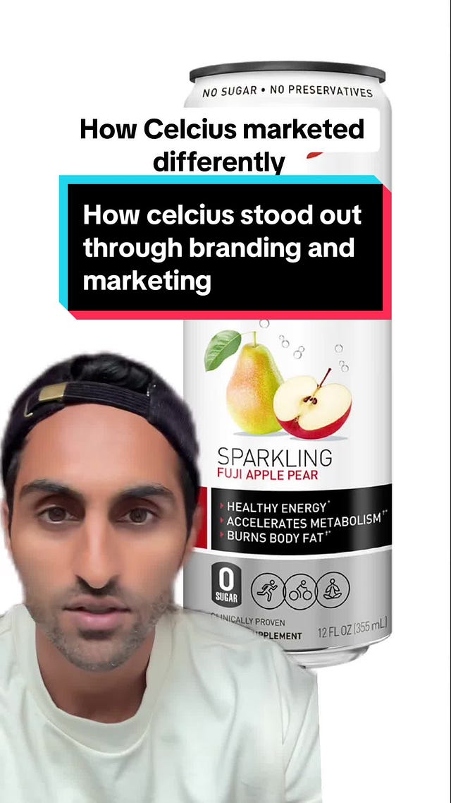
Bloom’s product contains more than just aesthetic appeal; it reflects values and attitudes. It feels friendly, accessible, and non-intimidating. Optimum Nutrition’s product feels high-stakes and slightly dangerous. Ashwinn, one of my favorite creators in the brand space, posted a great breakdown of this, analyzing energy drinks, here:
 Tiktok failed to load.
Enable 3rd party cookies or use another browser
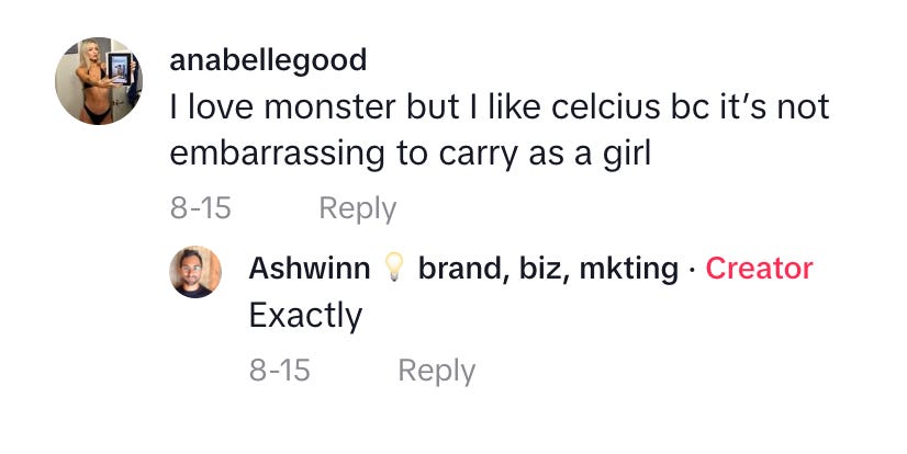
I think that this comment accurately reflects the sentiments of so many consumers around products like energy drinks or protein powders that have historically been marketed to a specific segment of the population:
It’s a smart move for Bloom and Celsius to launch more accessible products that attempt to reach an untapped consumer segment, and other CPG brands could learn a thing or two from them. What do you think? Have you seen other products that are expanding to new audiences through packaging changes? And are you seeing convergences in CPG brands designs, or are you seeing variation?
Let me know what you think in the comments.


Great read! It really made me think about how subconsciously my purchases are a reflection of me. Some brands I’m an obvious target for but there are a lot of things I wouldn’t buy because of their packaging. For example I wouldn’t buy Liquid Death because as a 56 year old mom I’d feel ridiculous walking around with that can. I’ve never really thought about that before.
This is one of my favorite topics to talk about! Packaging is everything and you nailed it: - everything is looking the same these days. I think about brightland’s pizza oil replicating graza, and how other companies are pivoting to the squeeze bottle because of the trend.